Color Psychology in Home Decor: Design That Feels as Good as It Looks
Chosen theme: Color Psychology in Home Decor. Discover how hues quietly shape mood, energy, and connection at home—then use that insight to craft rooms that support your daily rhythm. Join us, share your palette experiments, and subscribe for weekly color-smart ideas.
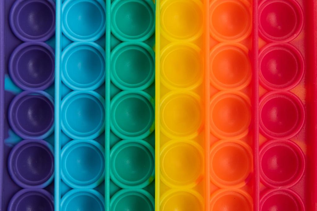
Warm colors tend to stimulate and energize, while cool tones soothe and steady. Neuroscience links color to arousal levels and perception of temperature, influencing comfort, productivity, and appetite. Tell us which shades change your mood most, and why they work for you.
Foundations: How Color Influences Mood at Home
Beyond hue, saturation and value shape intensity and depth. A soft, desaturated blue whispers calm, whereas a high-saturation teal commands attention. Play with lighter values for airiness, deeper values for coziness, and comment with your favorite balanced combo.
Foundations: How Color Influences Mood at Home
Warm vs. Cool: Choosing Energy Levels for Each Space
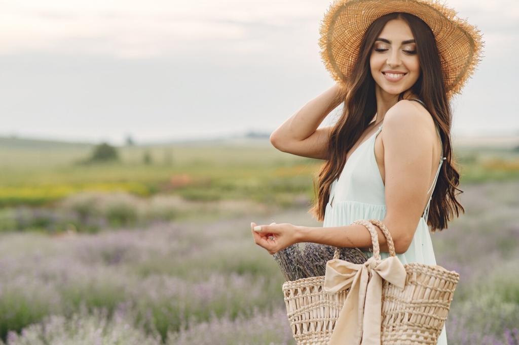
Warm Palettes for Gathering
Terracotta, muted coral, and honeyed neutrals spark appetite and storytelling around tables. I used sienna accents in a small dining nook, and dinners lingered longer. Try a warm runner or artwork first, then share your before-and-after impressions.
Cool Palettes for Restoration
Powder blue, sage, and foggy gray calm the nervous system and soften visual noise. A reader swapped charcoal curtains for misty green linen and fell asleep faster. Test a cool throw or duvet, then tell us how your evenings feel.
Room-by-Room Color Strategies
Soft blues, gentle greens, and dusty mauves slow the pulse and reduce visual clutter. One couple replaced bright white with pale eucalyptus and reported fewer late-night scrolls. Try swatching three calm tones near your headboard and share which feels most restful.
North light cools and flattens colors; south light warms and brightens. East-facing rooms glow in morning gold, while west-facing rooms amber at dusk. Share your room’s orientation and we’ll suggest hues that thrive there.
Bulb Temperature and Rendering
Choose 2700–3000K bulbs for cozy warmth, 3500–4000K for balanced task lighting, and high CRI for accurate color. A reader swapped bulbs and finally loved their ‘too gray’ walls. Tell us your bulb setup and we’ll help fine-tune tone.
Gloss Level and Texture
Matte hides imperfections and mutes color; satin reflects softly; semi-gloss pops trim and can intensify hue. On textured plaster, matte sage looked velvety and serene. Post a surface close-up and get finish recommendations tailored to your space.
Personal and Cultural Color Associations
A traveler curated a hallway of ocean blues after a healing trip to the coast; walking through became a daily exhale. List three colors tied to meaningful memories and we’ll suggest ways to weave them into decor.
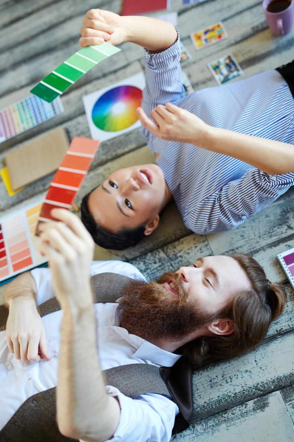
Test, Tweak, and Commit: Smart Color Decisions
Paint large sample squares on multiple walls to catch shifting light. Label each clearly and photograph morning, noon, and evening. Share your photos in the comments, and we’ll help interpret undertones that cameras often exaggerate.
Test, Tweak, and Commit: Smart Color Decisions
Combine paint chips with fabric, wood, metal, and stone to see synergy. A reader discovered her ‘perfect gray’ clashed with oak floors but sang beside walnut. Post your material lineup for feedback on undertone alignment.
Sustainable, Healthy Color Choices
Low-VOC and Natural Pigments
Choose low- or zero-VOC paint to reduce indoor pollutants and odors. Clay- and lime-based finishes add depth with gentle texture. If you’ve tried a mineral wash or lime paint, share your experience and drying tips for newcomers.
Longevity Through Timeless Hues
Timeless does not mean boring. Layer adaptable neutrals with seasonal accents to refresh without repainting. A renter rotates textiles seasonally to shift mood sustainably. Describe your favorite long-lasting base color and why you return to it.
Upcycling with Color
Color revives old furniture and reduces waste. A faded dresser became a cheerful entry statement in muted coral, guiding guests warmly inside. Show us a piece you might repaint, and we’ll suggest a psychologically aligned hue.