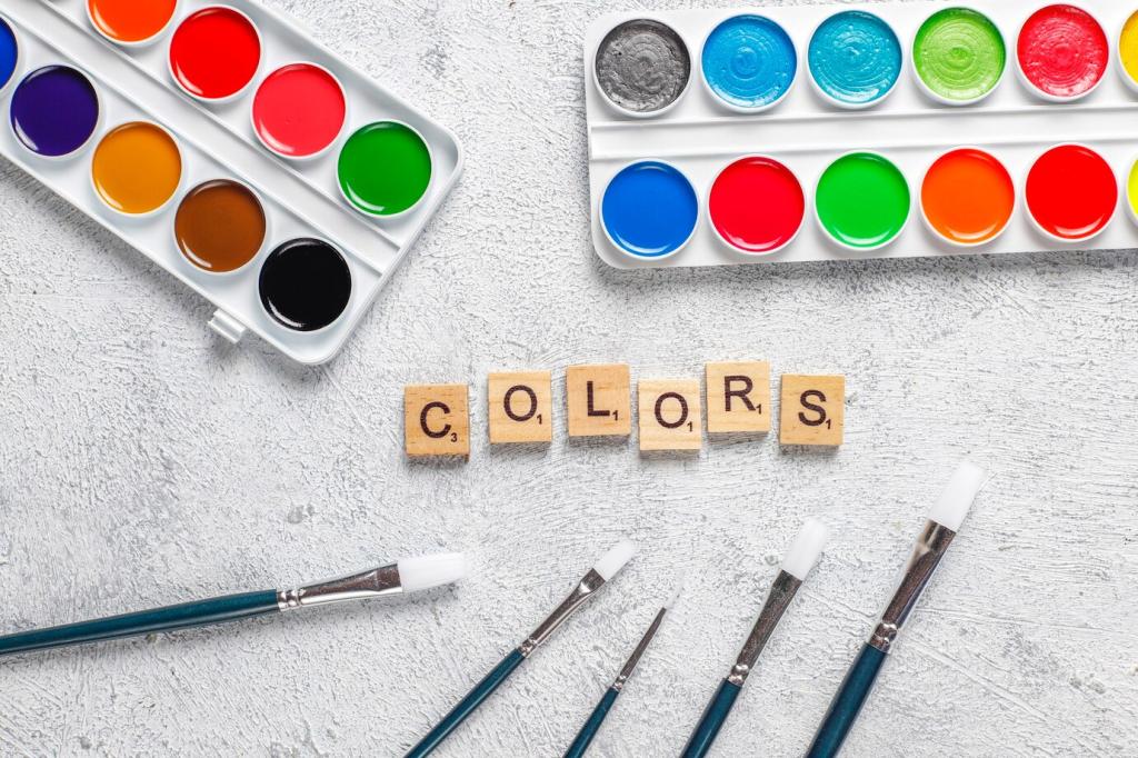
The Color Wheel, Decoded for Interiors
Pair opposites by softening saturation, then anchor with generous neutrals. Try dusty blue with muted terracotta, guided by the 60-30-10 rule. Layer textures—linen, wood, clay—to merge energy and calm without overwhelming the eye.
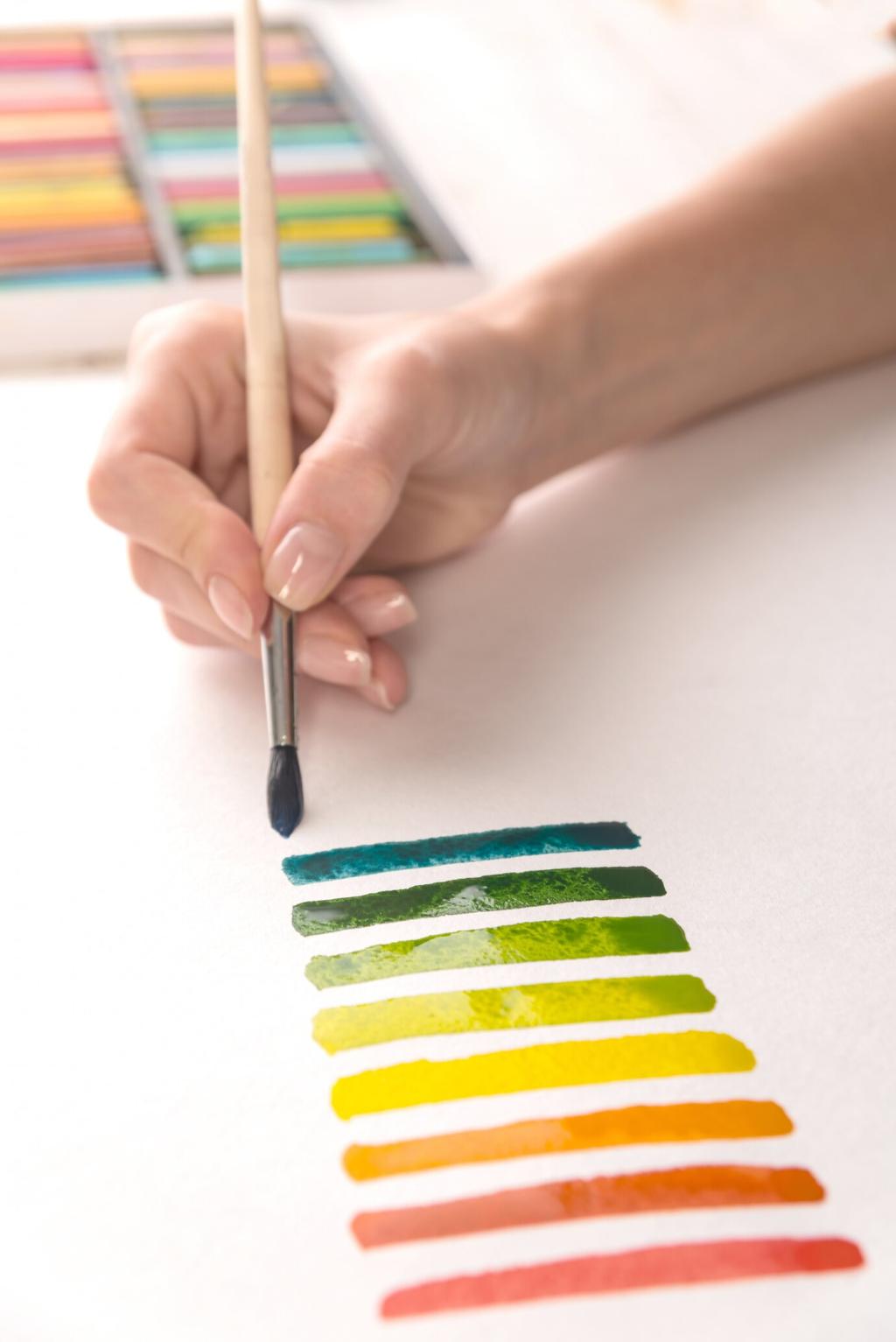
The Color Wheel, Decoded for Interiors
Choose three neighbors on the wheel, like olive, moss, and sage, and assign distinct roles: walls, upholstery, accents. Vary value and texture to avoid monotony. Comment with your favorite analogous trio and how it changed your room’s rhythm.
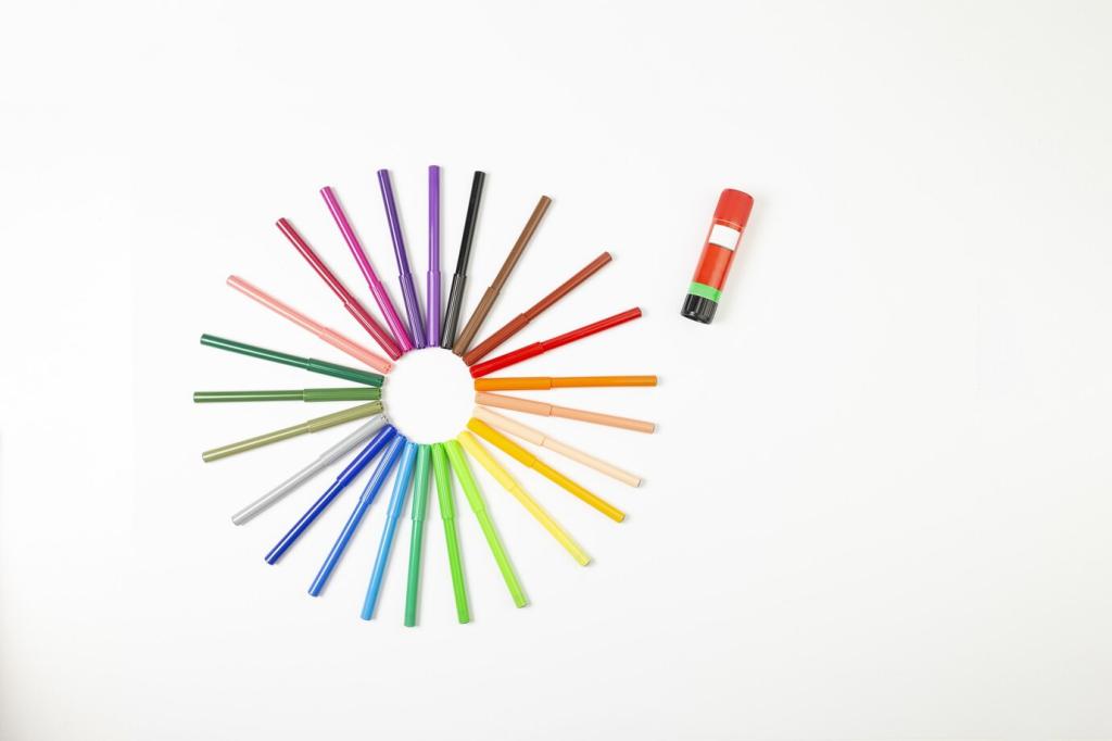
The Color Wheel, Decoded for Interiors
Pick three equidistant hues, but let one lead. Desaturate the other two and confine brights to small accents. Echo the palette across rooms with rugs and art, then tell us which triad felt surprisingly livable in your space.