Creating a Balanced Color Palette for Interiors

Chosen theme: Creating a Balanced Color Palette for Interiors. Welcome to a calm, color-smart approach where hues work together like a well-rehearsed ensemble, elevating every room without shouting. Stay with us, ask questions, and subscribe for fresh color wisdom weekly.

Why Balance Matters in Interior Color Palettes

Colors influence our cortisol levels, attention, and comfort. Balanced palettes keep overstimulation in check while avoiding emotional dullness. Think of balance as a steady heartbeat for a room. Have you felt instant calm in a well-composed space? Tell us.

Foundations: Neutrals, Accents, and Undertones

Reading Undertones Like a Pro

Whites lean warm with yellow or cool with blue; grays can hide green, purple, or brown. Compare swatches side by side over white paper. Notice shifts? Snap photos at different times and post your comparisons to discuss.

Building a Dependable Neutral Base

A base of sympathetic neutrals—greige, stone, oat—stabilizes brighter notes. Textures keep it lively: linen, plaster, rattan, boucle. Aim for tactile variety first, then color variety. What’s your favorite neutral texture combo? Share and inspire others.

Setting Ratios That Work

Use the classic 60-30-10 rule as a starting point: dominant base, supportive secondary, focused accent. Adjust to 70-20-10 for calmer spaces. Document your ratios in a note and report back how the room feels after changes.

Light, Space, and Material: How Context Changes Color

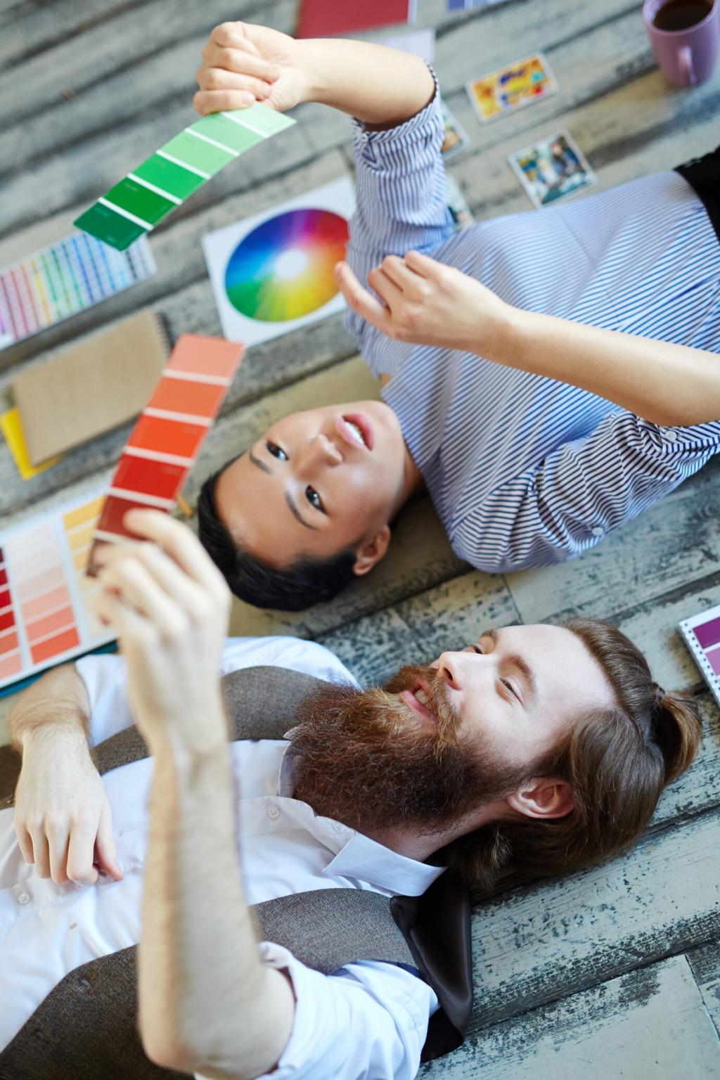
North light cools color; south light warms. Warm bulbs (2700K) deepen reds and creams; cool bulbs (4000K) sharpen blues and grays. Try switching bulbs for a week, track mood shifts, and comment with your observations.

Light, Space, and Material: How Context Changes Color

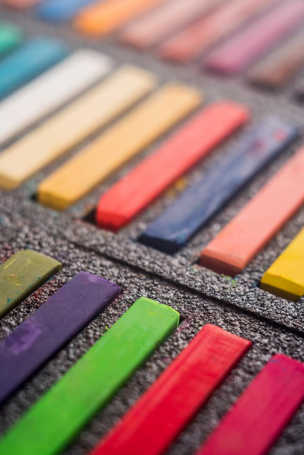
Matte hides imperfections and softens tones; satin reflects more light; gloss amplifies saturation and contrast. Rough textures mute color; polished surfaces intensify it. Test sample boards with different sheens and tell us which finish surprised you most.

Monochromatic Without Monotony

Select one hue and build depth through tints, shades, and textures. Example: layered olive, moss, and sage with brass detail. Add pattern for movement. Tried monochrome? Post a photo and we’ll suggest a texture upgrade.

Analogous Flow

Pick neighbors on the color wheel—blue, blue-green, green—for seamless transitions. Keep saturation varied: one mid, one soft, one deep. This approach nurtures continuity in open plans. Share your trio, and we’ll help tune the intensities.

Complementary Contrast with Restraint

Opposites attract—like rust and teal—but balance requires scale control. Let one dominate, one accent, and neutrals mediate. If the clash feels loud, desaturate both. Drop your complementary pair below for a custom calming tweak.

Practical Process: From Inspiration to Swatches to Walls

Gather fabric scraps, tile chips, wood samples, and print photos. Arrange by temperature and value, not just color name. Ask: what feeling repeats? Share your board theme, and we’ll suggest two supporting neutrals.

Practical Process: From Inspiration to Swatches to Walls

Paint large samples on foam boards, move them around, and check morning, noon, and evening. Photograph under different bulbs. Keep notes on glare and shadow. Report back with your top two; we’ll help choose the winner.

Practical Process: From Inspiration to Swatches to Walls

Great palettes often emerge after removing one beloved color. If every hue shouts, none speaks. Challenge yourself: eliminate one swatch today, wait 24 hours, and share if the room feels clearer or empty.

This is the heading

Lorem ipsum dolor sit amet, consectetur adipiscing elit. Ut elit tellus, luctus nec ullamcorper mattis, pulvinar dapibus leo.

This is the heading

Lorem ipsum dolor sit amet, consectetur adipiscing elit. Ut elit tellus, luctus nec ullamcorper mattis, pulvinar dapibus leo.

Sustainable and Timeless Choices

Choose low-VOC, mineral-rich paints that deliver stable undertones. Natural pigments often patinate beautifully under daylight. Share your favorite eco brand and finish; we’ll compile a community-tested list for subscribers.

Sustainable and Timeless Choices

Avoid hyper-trendy neons as anchors. Lean on complex neutrals, muted blues, soft terracottas, and olive greens. They welcome seasonal accents easily. What’s your long-haul color crush? Add it below and we’ll offer pairing ideas.
Rialansia
Privacy Overview

This website uses cookies so that we can provide you with the best user experience possible. Cookie information is stored in your browser and performs functions such as recognising you when you return to our website and helping our team to understand which sections of the website you find most interesting and useful.